Welcome to week 8 of UX Design Roundup, where we will be cracking open some wikis! If you're not familiar with a wiki, it's a website that provides information on a topic and is contributed to by a large group of people familiar with the subject. I have found two great wikis for examples of good and bad UX design in the form of video game wikis for Stardew Valley (the title may seem familiar from week 6) and Kenshi. If you're wondering what happened to week 1, it's running a little late. I'm starting to think that seedy-looking panel van it got into with the sign "Definitely Not Kidnapping Taxi Service" on the side wasn't a cab at all...
Stardew Wiki
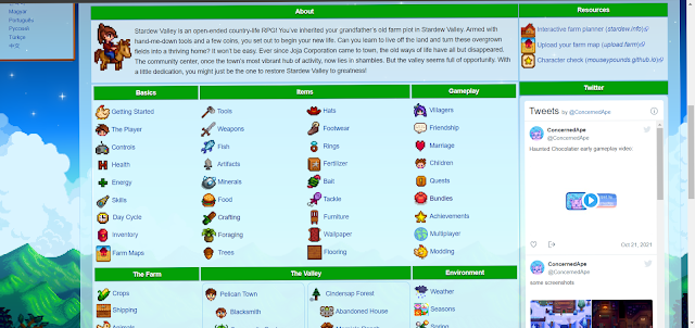
If you read the week 6 showdown, you'll know the developers of Stardew Valley have a great thing going when it comes to UX design, but what about the fan-created wiki for the game? The website's front page (stardewvalleywiki.com) sports an immediate breakdown of essentially all the game's content broken down into easy-to-scan categories. Even if you've never played the game, you can test the design by finding the answer to the following three questions:
- What is the best gift to give Abagail on her birthday?
- When and where can you catch a walleye?
- What do you need for the first farmhouse upgrade?
Turns out the fans of Stardew Valley have a knack for good UX design themselves! I'm betting you were able to find the answers to those questions quickly, even if you had no idea what the game was about. The trickiest is probably the farmhouse upgrade, but the upgrade costs are listed on the carpenter's shop and the farmhouse pages. You're introduced to the carpenter and told she does the house upgrades on day one of the game, so I can't really dock them any points there.
Kenshi Wiki
Upon arriving at the Keshi wiki (
kenshi.fandom.com), you are immediately confronted with ads. So. Many. Ads. As you're trying to close them, you may get the lovely pop-up box with another ad. Right away, this wiki has started on the wrong foot with me, and I'm already considering going elsewhere. Next, I was given several sections, including reviews, editing guidelines, stats about the wiki, and a game description. If I'm coming here for information about something in the game, then none of this is remotely helpful. Let's use the same test to analyze the layout by finding the answers to the following three questions:
- How do you level up a character's Strength attribute?
- Where can you find a blueprint for Ninja Blades?
- How do you recruit the character Beep?
If you have no idea where to even start without using the cleverly hidden search function (not good), then I'll point out the non-descript navigation menu you missed right above the word "Home" at the top of the page. Knowing where the menu is and having played the game extensively, I'm still not 100% confident where I'm going even though I know the answer. Even when you get to the page you need, there is so much information there it's like wading through mud to find what you need.
Conclusion
Even though I'm a fan of both games and immensely enjoy them, the wikis are in entirely separate leagues from one another. As usual, Stardew Valley takes home the gold with broken-down information easily navigated and cross referenced enough to make mistakes painless. Kenshi, on the other hand, does everything wrong despite having less data. Valuable items are hidden and buried while the non-necessary ones are emphasized and clearly presented. All of this, of course, is coated in a genuinely nauseating layer of advertisements. Be sure to join us next week for another round of UX Design Roundup!


Comments
Post a Comment