Week 9: Twitch Vs Youtube
Welcome to Week 9 of UX Design Roundup where we will be tossing two different streaming services into the ring. Our contenders are the popular platform for watching others play videos games called Twitch and the video service to find both the immensely interesting and the brain-melting strange known as YouTube. Both rely on user content which is all over the UXD map, so we will be focusing on how the platforms handle this mess. Oh, and if you're wondering what happened to Week 1, it got locked in the cloning tank over a three-day weekend and now we're not sure which is the real one...
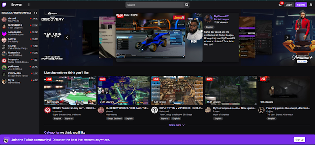
Twitch
When I land on Twitch's home page, there is a ton of stuff being thrown at me all at once. I'm a little overwhelmed, but once the initial shock wears off I start looking around. I am not logged in to simulate a first-time visitor, but already I see a list of things on the left that look like friends online. Also, the little red bubble at the top of the page seems to suggest I have 45 unread messages! How? I'm now suspicious and a little annoyed.
Disoriented, I check the biggest thing on the page that looks all nice and polished to see a feed already playing. A little presumptuous to think I am ready to watch whatever that is since we just met each other. Then I notice the slick-looking wrapping around it is an ad for something. Not only have you started playing something without my permission, but now your already trying to sell me stuff? My eyes wander down to a list of other channels I might find interesting, but my trust is already eroded. Worse, all the prominent styles and moving parts are yelling for my attention and I have no idea where to go! Odds are, I'm going to back away slowly and simply go someplace else.

YouTube
When YouTube's front page loads it's a very different story. The first thing I notice is a list of videos I might like broken up into categories. This is the equivalent of saying "Hey there, I don't know you but take a look at what I have." I'm a little on guard, but curious so I'll take a look. The initial selection seems kinda interesting, but I'm going to poke around for a bit. The next thing I notice is the big banner thing, and big surprise, it's an ad. Great.
This ad is for a YouTube service plan though and rather targeted at that. It's asking for money by shoving a flyer in my face, but this at least is for more functionality for the platform I'm currently on and not something unrelated. I'm not interested in that, so my eyes go to the sidebar where I can ask to see content based on what I'm interested in. There are even more categories listed across the top. It's a little overwhelming, but nothing is moving or flashing so I feel like I can take my time and safely dig deeper.
Conclusion
Twitch wants you to pay attention to a hundred things at once and does little to filter and categorize the mind-boggling mass of content it supports. YouTube on the other hand keeps the noise to a minimum and lets you progress at your own pace, which is both pleasant and effective at keeping a user from leaving. If they would stop asking me if I want to try YouTube TV all the time when I'm signed in I'd be happier, but not bad as it is. Be sure to join us next week for another round of UX Design Roundup!
Comments
Post a Comment