Week 4: YNAB Vs YNAB Classic
Welcome to Week 4 of UX Design Roundup. This week we are changing things up a little and seeing what happens when we add time travel into the mix. We will be comparing a budgeting program called You Need A Budget (or YNAB) to itself. The system evolved into an entirely separate web app instead of simply upgrading, so we will leverage this to see how user experiences grow. You may be wondering what happened to Week 1. I saw it tearing the tags off of mattresses when touring the factory. Security didn't seem happy about it, but what's the worst that could happen?
YNAB Classic
The original YNAB is no longer supported, and the company has pulled it from sales, but if you bought it back in the day, the program is still functional. The revolutionary change YNAB brought to the scene was the idea of zero balance budgeting, where you assign each dollar you receive a budgeted category. Traditional budgets usually stressed having a savings category and figuring out your bills compared to how much money you would make in a month. In YNAB, you dedicate money to save for something, like a new car or a house. You also don't forecast income but only budget cash on hand, making a difference for variable income jobs, like waiting tables.
YNAB Classic suffered from some UX issues, though. For one, there was initially no companion app, so trying to keep up with transactions as they happened was tricky. This was compounded by the inability to auto-import transactions from your bank. You could import the statement at the end of the month, but then you were stuck wading through tons of items all at once. They eventually added an app, but since it was based as a local program, you had to jump through some hoops with dropbox to get stuff to sync between the two.

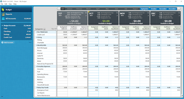
YNAB Current
The company decided to switch from a pay once to a subscription model. The change required a ground-up redesign, so they launched it as a fully independent system. Instead of a local program, they did it as a web app which allowed the users to ditch the Dropbox workaround. If you had your computer, you could access your budget anywhere with internet access, but if you didn't, they had a smartphone app available from day 1.
Part of YNAB's utility comes from manually inputting transactions, which makes you keenly aware of your spending habits. Still, the new version recognized there needed to be some compromise here too. You can now directly link your bank accounts and import whenever you need to, plus it has a very robust transaction matching system that cuts out nearly all duplicate entries. It's not perfect as the method of handling credit cards is somewhat mind-bending, and the system comes with a severe learning curve. To their credit, the company is committed to addressing these issues. It has added an incredible amount of tutorials and free live classes (even if you don't have a subscription) to help.
Conclusion
While the YNAB classic was enough to literally change lives, it had some flaws that really held it back. I think we can all agree that managing our finances is hard enough as it is; we certainly don't need any added layers of budgeting software woes. The current version of YNAB packs all the punch of Classic but removes the barriers by leaps and bounds. Personally, I find myself saving far more money using it than I spend on the monthly fee. Join us again next week for a fresh match of UX Design Roundup!
Comments
Post a Comment